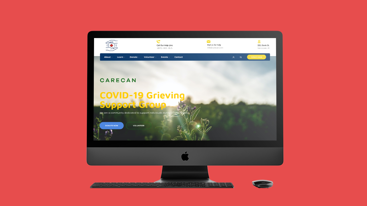
CareCan – COVID-19 Grieving Support Group Web Application
Branding • Wireframing • Web Designing
Introduction
CareCan is a fictional non-profit organization created for a specific user archetype and target audience in mind. The main feature of the web application was the donation process and reaching out the support team through contact page.
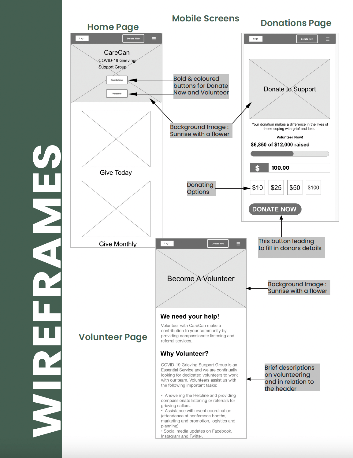
The web app design was implemented and made interactive with an emphasis on modern and minimalism that is consistent with the brand's mission using Wordpress. In addition, low-fi mobile app wireframes were completed using Adobe XD for future implementation.
About CareCan
A common platform of support for COVID-19 grieving people. A place were professional counsellors, recreation therapists, and educators connect with individuals/groups of individuals in modifying their life by helping them find the balance between psycho-physiological well-being.
-
Role
UI/UX Designer
Graphics Designer -
Duration
3 Weeks
-
Tools Used
Ideation & Research
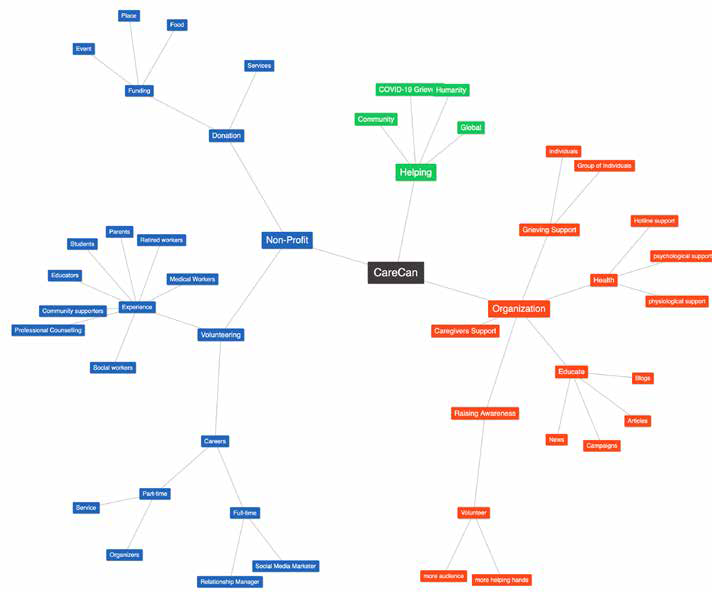
I conceptualized using Mind Map to visually represent my thoughts. The below keywords helped me to familiarize, label content and organize what the organization is looking forward to project towards its audience.
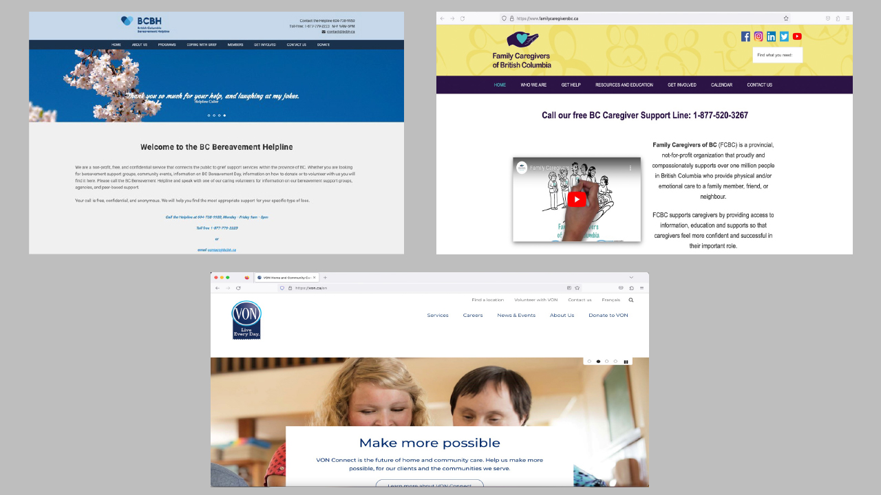
I reviewed the below competitor websites from aesthetics to functionality. To get a sense of the user's pain points, I analysed the comment and reviews on google and the app store. The purpose of having a mobile prototype was that none of the competitor websites had a mobile interface.
Branding
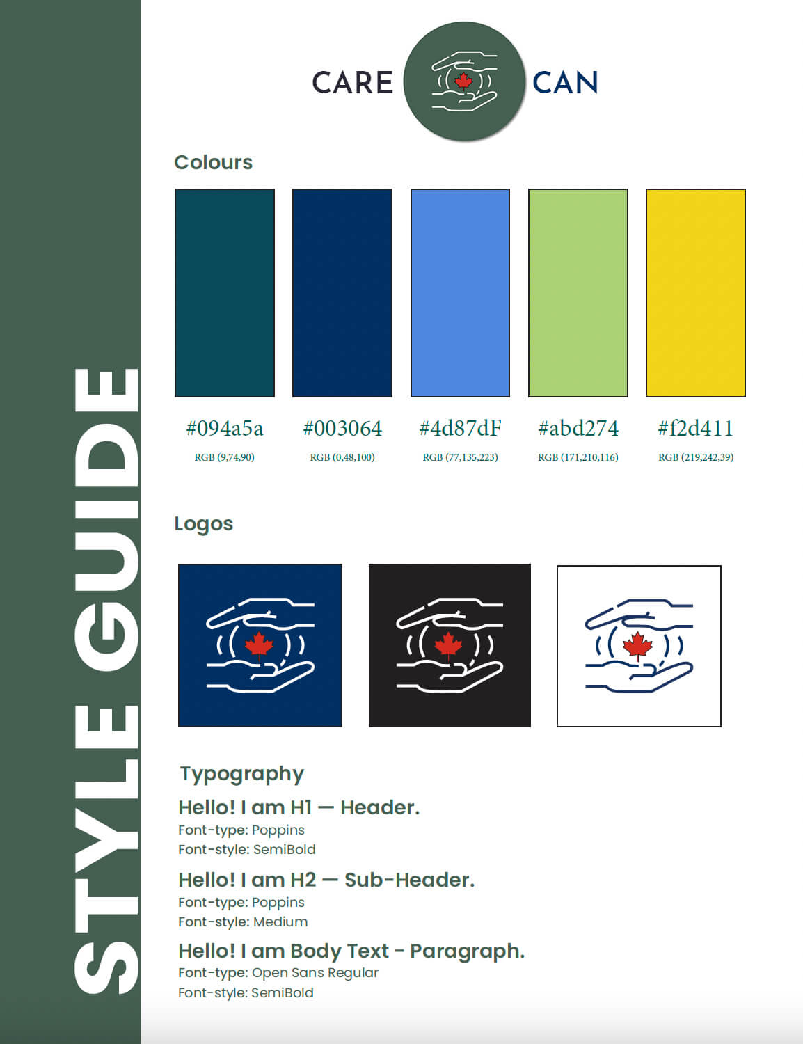
I created a fictional brand and designed a consistent user experience to align with the brand's vision. My idea was to create unique visual designs, which is why I designed a logo and style guide.
Developing Persona & Scenario
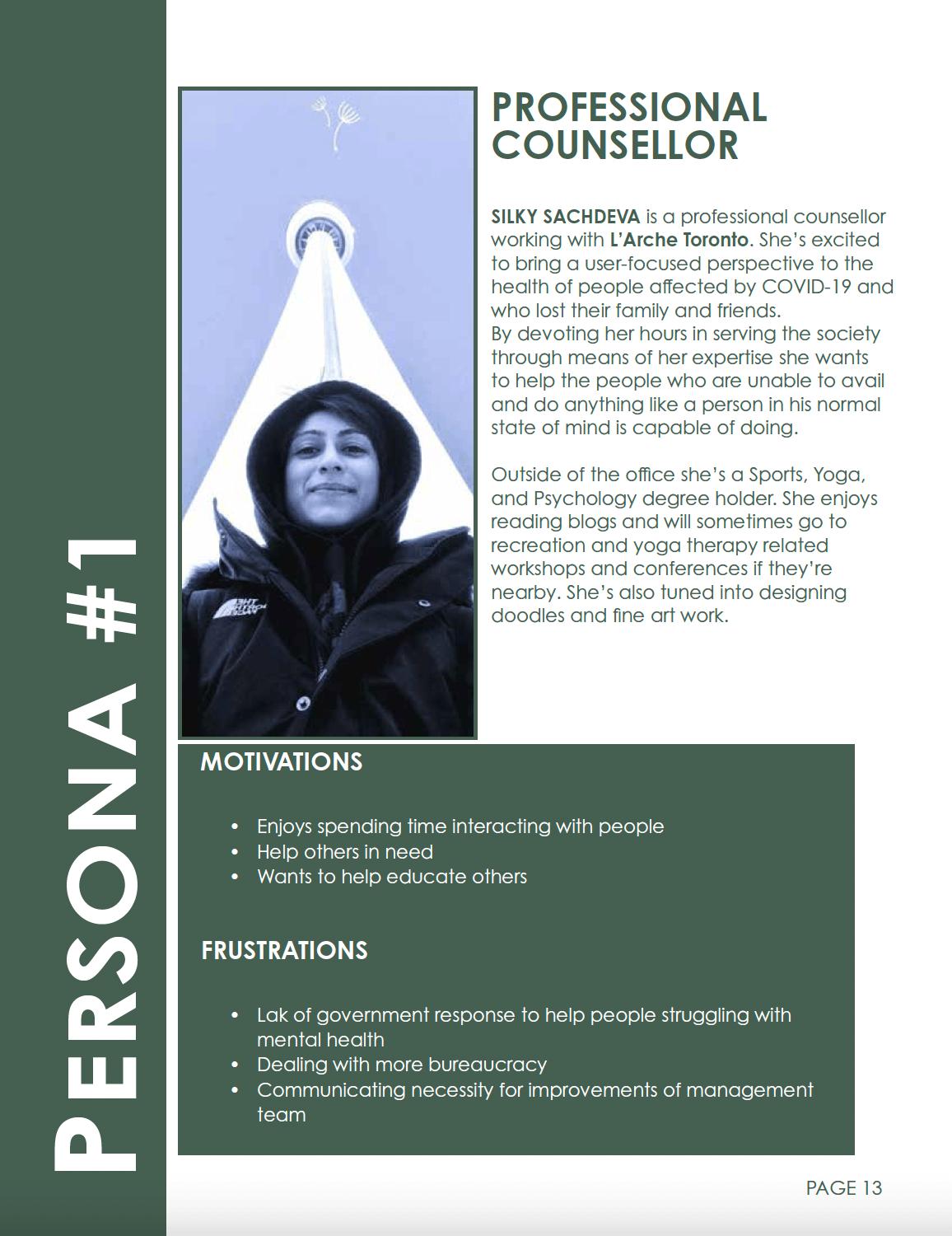
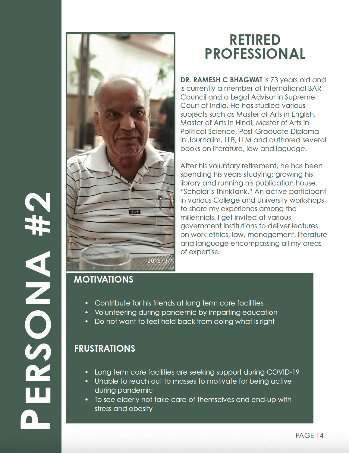
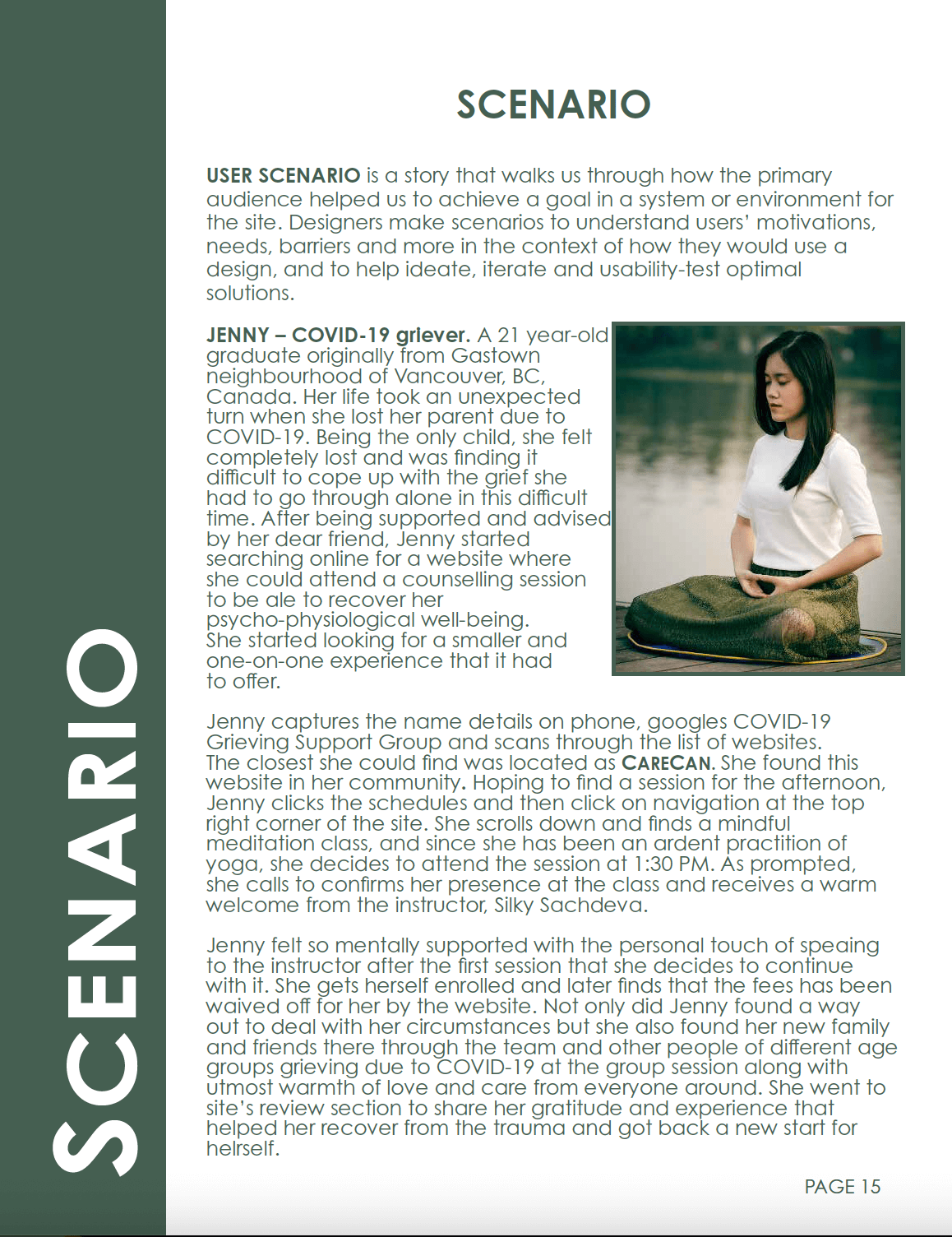
I created a persona to understand the needs and challenges of our primary and secondary audience, who are the people grieving due to covid-19 and professional counsellors respectively. Then, I developed a user scenario based on the persona to show how and why a user would use our web and future mobile app.
User Flow
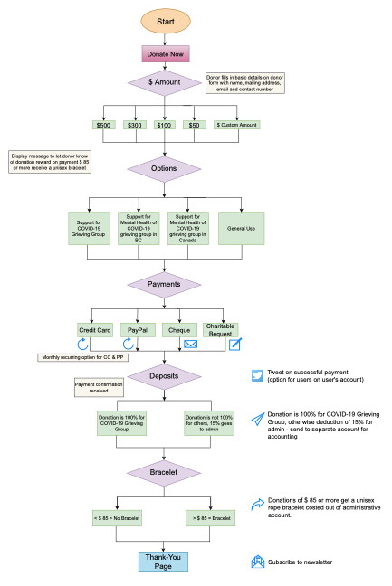
The Donation flowchart was created to map and illustrate the steps through a complete process cycle. The donation process was simplified as it had some specific requirements that I felt were somewhat complex to code.
Low-fi wireframes
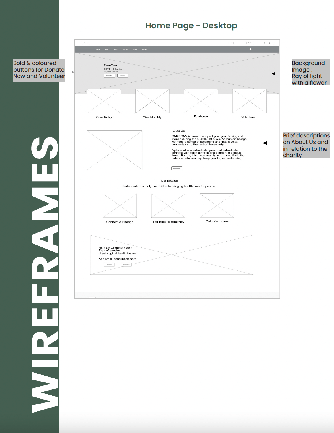
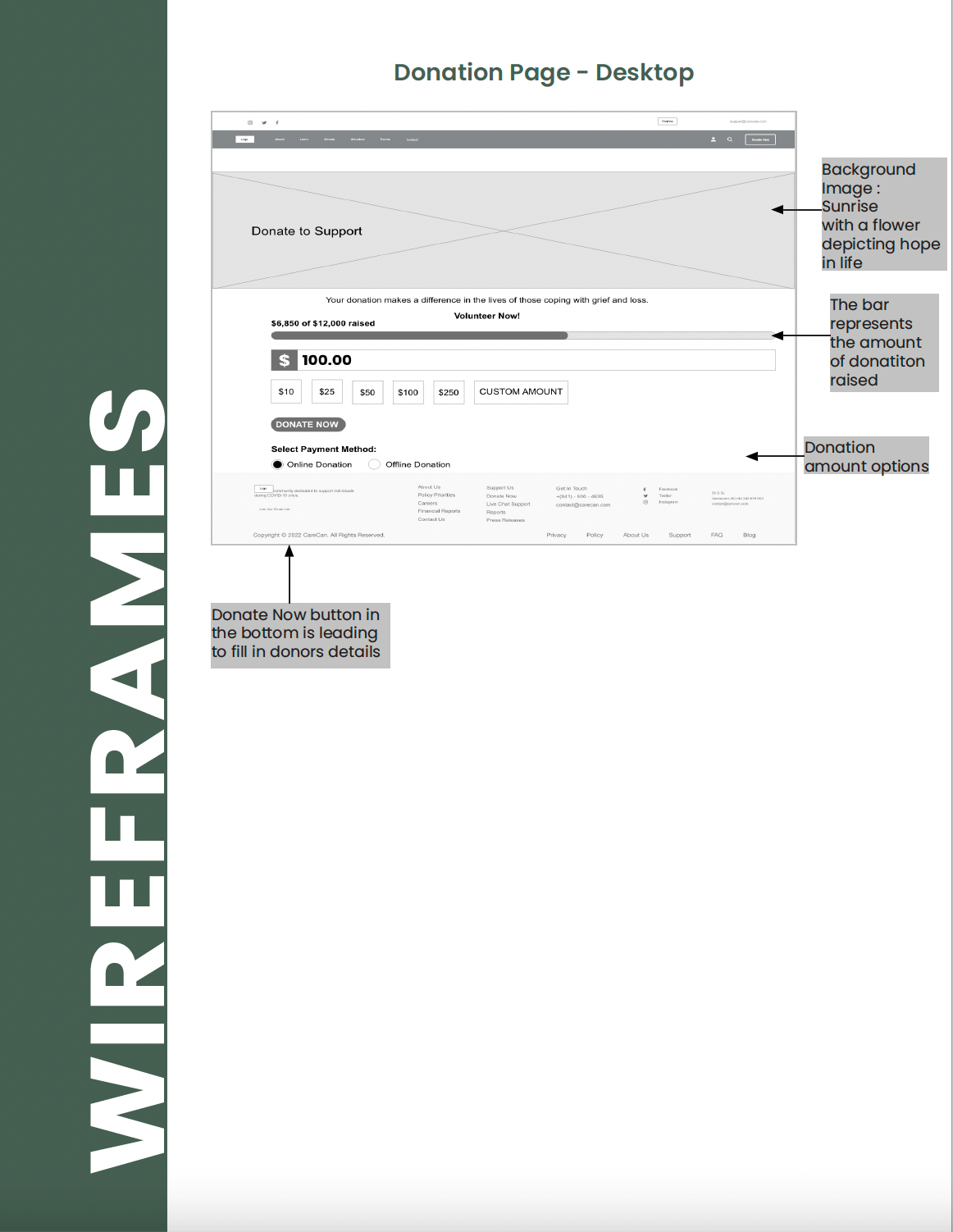
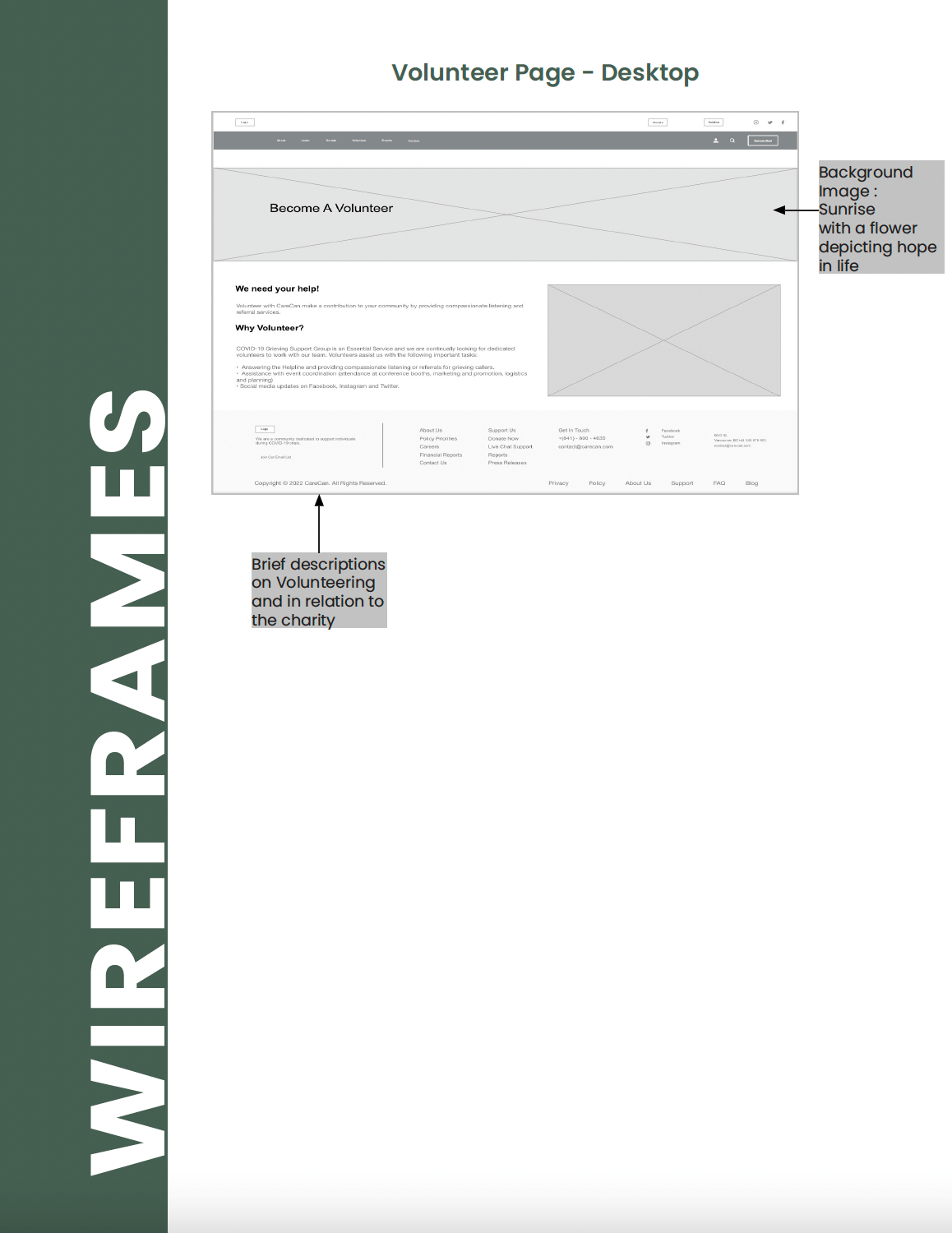
I created sketches of the main screens for the app, which included the home, donation and volunteer page. Additionally, I designed extra screens to showcase other features such as contact page with form, which was then converted into Low-fi wireframes using Adobe XD.
Key TakeAways
Being able to come up with an idea and having the opportunity to create something that I know would have made a difference in my own circumstances is truly rewarding. As a designer this project has been satisfying because I was able to combine my passion for graphic design and psycho-physiological well-being, while also challenging myself to develop my UI/UX and web design skills.
