Sienna Opticals — Blue Light Eyeglasses | 3D Package Design
Branding • Packaging • Graphics
Introduction
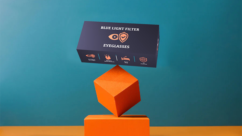
A 3D package design for the best-selling product of a fictitious business called Sienna Opticals using Adobe After Effects and Photoshop.
-
Role
Graphics Designer
-
Duration
3 Weeks
-
Tools Used
Ideation & Research
An initial meeting was setup with the client to discuss ideas for the 3D package design of their product Blue Light Eyeglasses. The client came up with comapny name Sienna Opticals, an optical frames company. As for the theme and colour scheme, they wanted the main color to be Burnt Sienna that invoked warm yet vibrant vibes using contrasting shades of indigo, yellow, blue with a blend of black and white neutral colors.
Logo Design
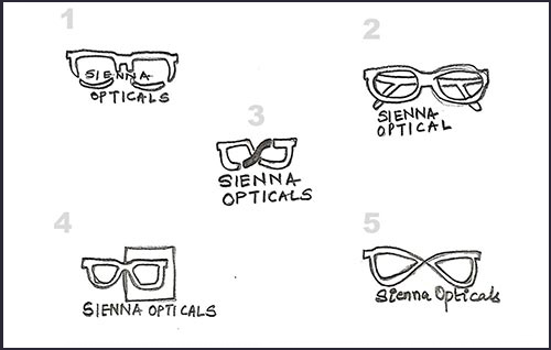
To meet the expectations of an attractive design for young audience, I sketched 6 logo thumbs to have a consciously recognizable yet trendy look and this research in the pre-production stage required to invest a lot of time which turned out to be satisfying with the final output.
Once the logo idea was selected, vector graphic versions were made using Adobe Photoshop 2022. The final logo was extracted at a resolution of 150ppi in JPEG format.
Business Card
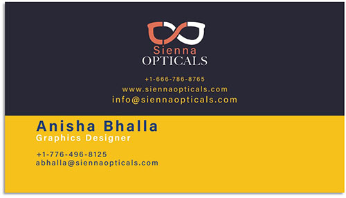
After the completion of Logo Design, feedback for addition of one bright color from client, worked well for the business card design.
In contrast to the shade of blue violet, a warm shade of yellow was added to create visual separation, allowing a distinct section for each company and employee details to be filled in with a lot of information in a small area of the card, while keeping it readable & aesthetically appealing simultaneously.
2D Graphics
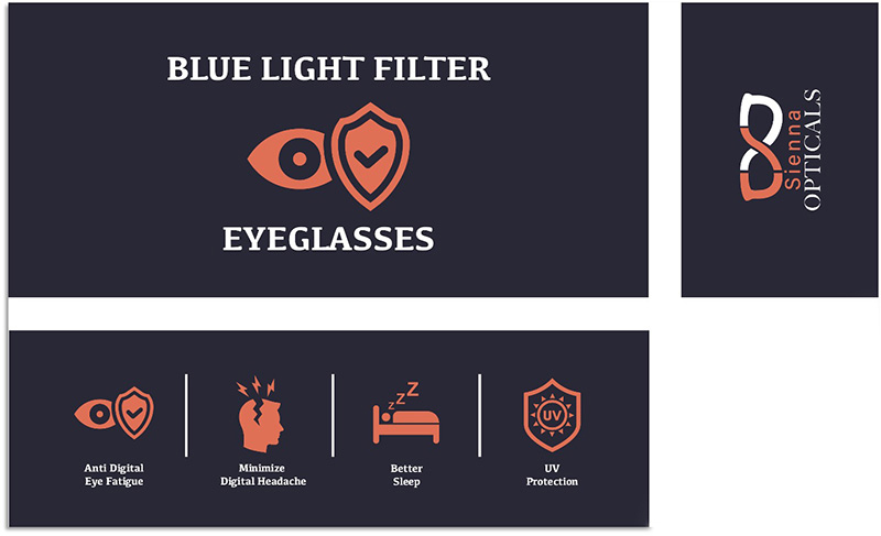
After the completion of Logo Design, feedback for addition of one bright color from client, worked well for the business card design.
In contrast to the shade of blue violet, a warm shade of yellow was added to create visual separation, allowing a distinct section for each company and employee details to be filled in with a lot of information in a small area of the card, while keeping it readable & aesthetically appealing simultaneously.
3D Package Design Mockup
The rasterized images from Adobe Photoshop were exported as JPEG files to import in Adobe After Effects.
The 3D rendered resulted in a scene displaying boxed product by itself, on a surface, posed in a ¾ view with all 3 sides of the graphics visible in one view that was created using Adobe After Effects.
The idea was to add an Environment layer and two light sources to compliment the product. To understand the 3D space and placing the light sources was the biggest challenge for me. The final product demonstrates shadows and reflections for realistic effect with a slogan.
