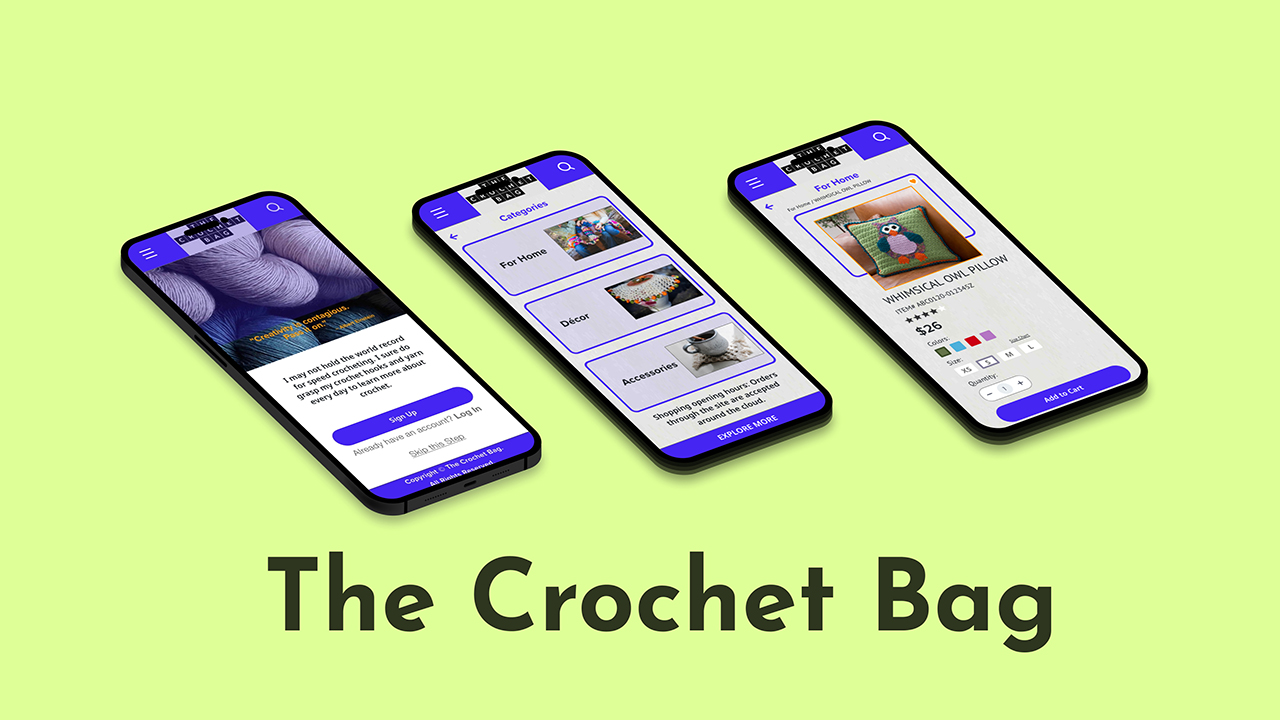
The Crochet Bag — Mobile App Prototype and Web Application
Branding • Wireframing • Prototyping • Usability Testing
Introduction
The Crochet Bag – is a dedication to my sister’s passion for creating hand crafted crochet products that was developed to create an interactive mobile app prototype annd web application along with a usability report for selling crochet product. The prototype and website was tailored to a specific user archetype and target audience by using Adobe XD. The user testing was completed using Useberry.
-
Role
UI/UX Designer
-
Duration
3 Weeks
-
Tools Used
Ideation & Research
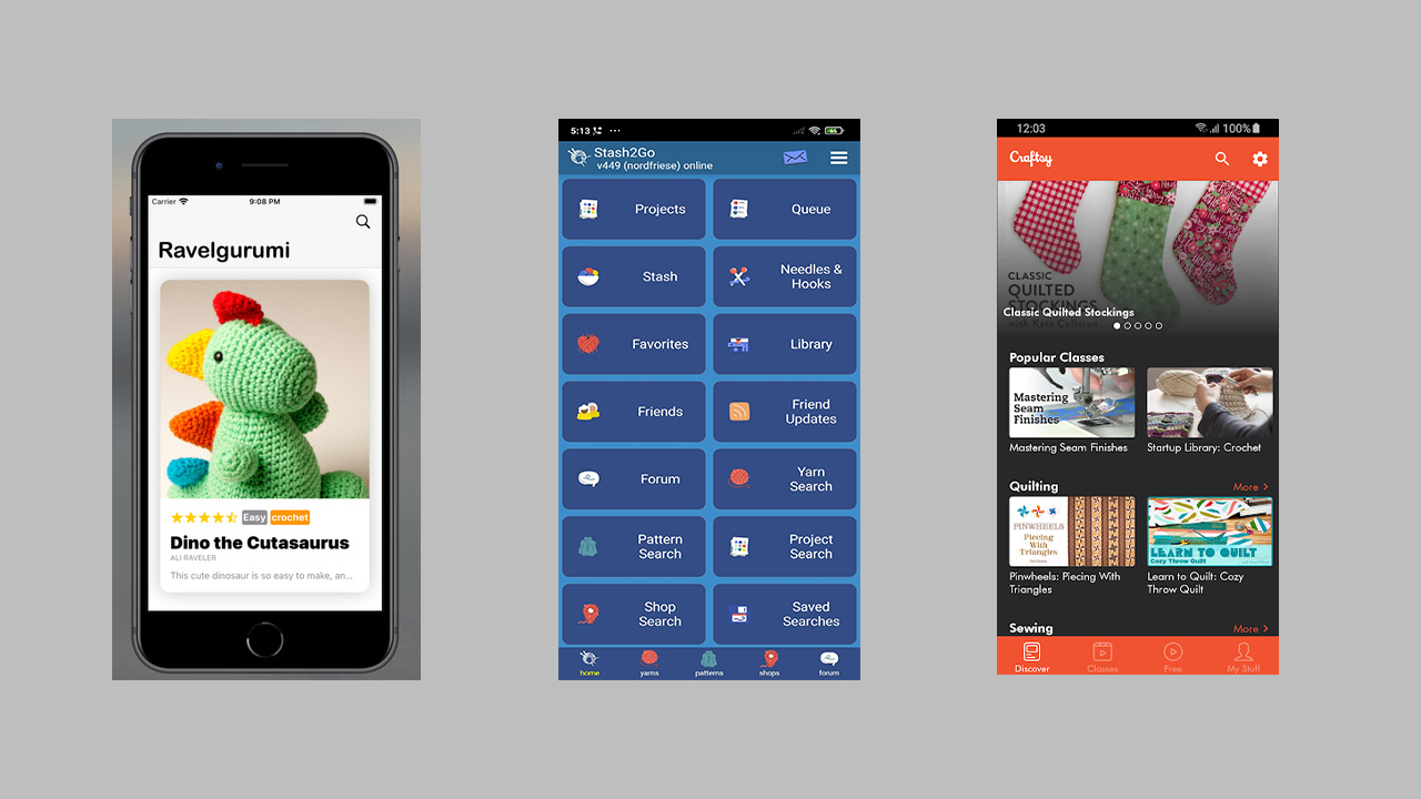
When I was looking into existing crochet apps from the following brands Ravelgurumi, Stash2Go, Craftsy for my research part, I realised that none of the apps had a feature for selling crochet products. So, I came up with the idea to create a mobile commerce app that would allow users to browse and buy handmade crochet products. I planned to include screens that will organize the products into categories and present them in a card format making it easier for users to filter out their product search.
Developing Persona, Scenario and UserFlow
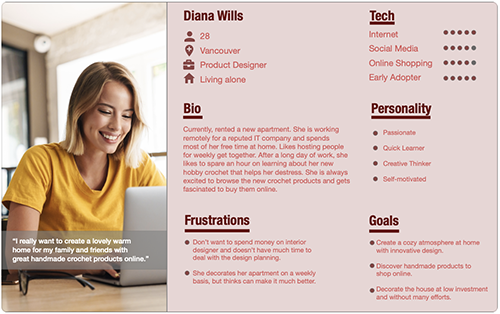
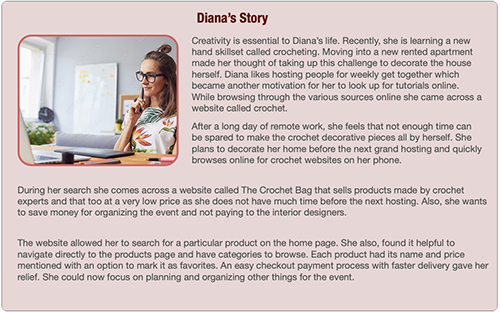
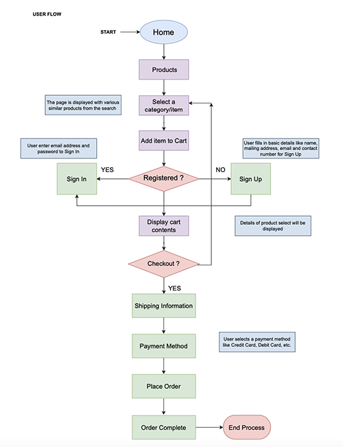
I created user persona and user scenario to have a better understanding of the pain points and goals of the target audience. So, that I could apply the solution to the design of the app. Then I created a flowchart using add the link in webpage https://app.diagrams.net/, detailing the steps a user would take to create an account, log in, and purchase an item.
Referring to competitor crochet ecommerce apps helped me to collect a lot of information about the design, style, layout of the mobile application. Furthermore, the topic selected because of personal interest made the information gathering process much simpler and easier. Based on the research done, the objective was to ensure the navigation of the user flow process decided upon is user-friendly.
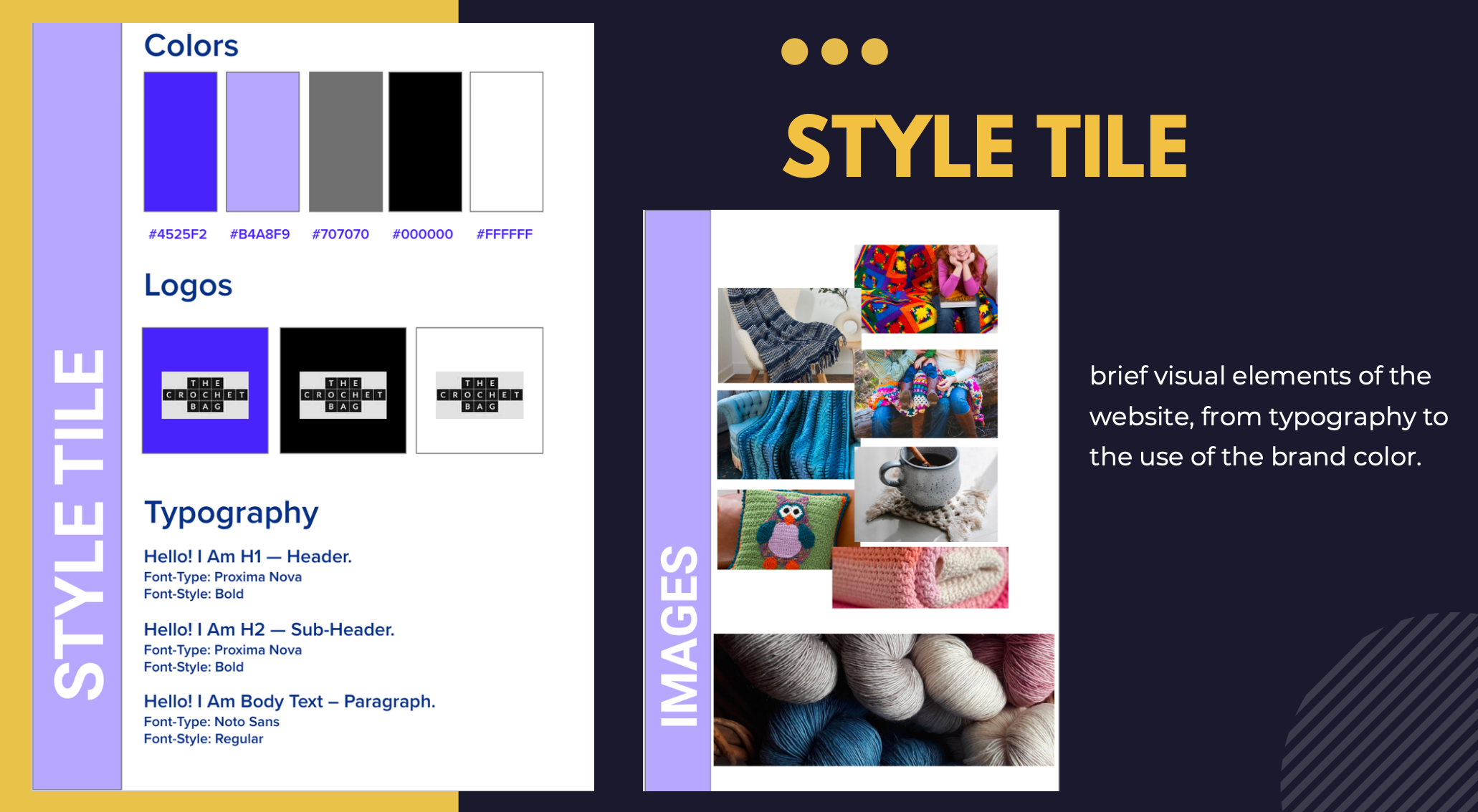
Style Tile
For the style tile, I picked the monotone theme of indigo-blue. The tint and shade of it gave a bright and sharp contrast to keep consistency with the branding.
For the typography, I used PT Sans ease of readability on mobile phones.
The hard part was that to find royalty free images that goes well with the concept. Most of the images were all copyrighted works, so it took some time.
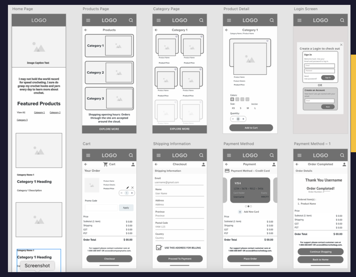
Wireframe and Interactive Prototype Creation
The lo-fi wireframes were created for the screens according to the user flow — the landing page, categories, product view, product details, sign in/sign up, and checkout. Furthermore, I added an icon to bookmark the products.
The main intent of prototyping the app was to make it an exclusive mobile commerce app. Let people be aware and explore the feeling of buying crochet products.
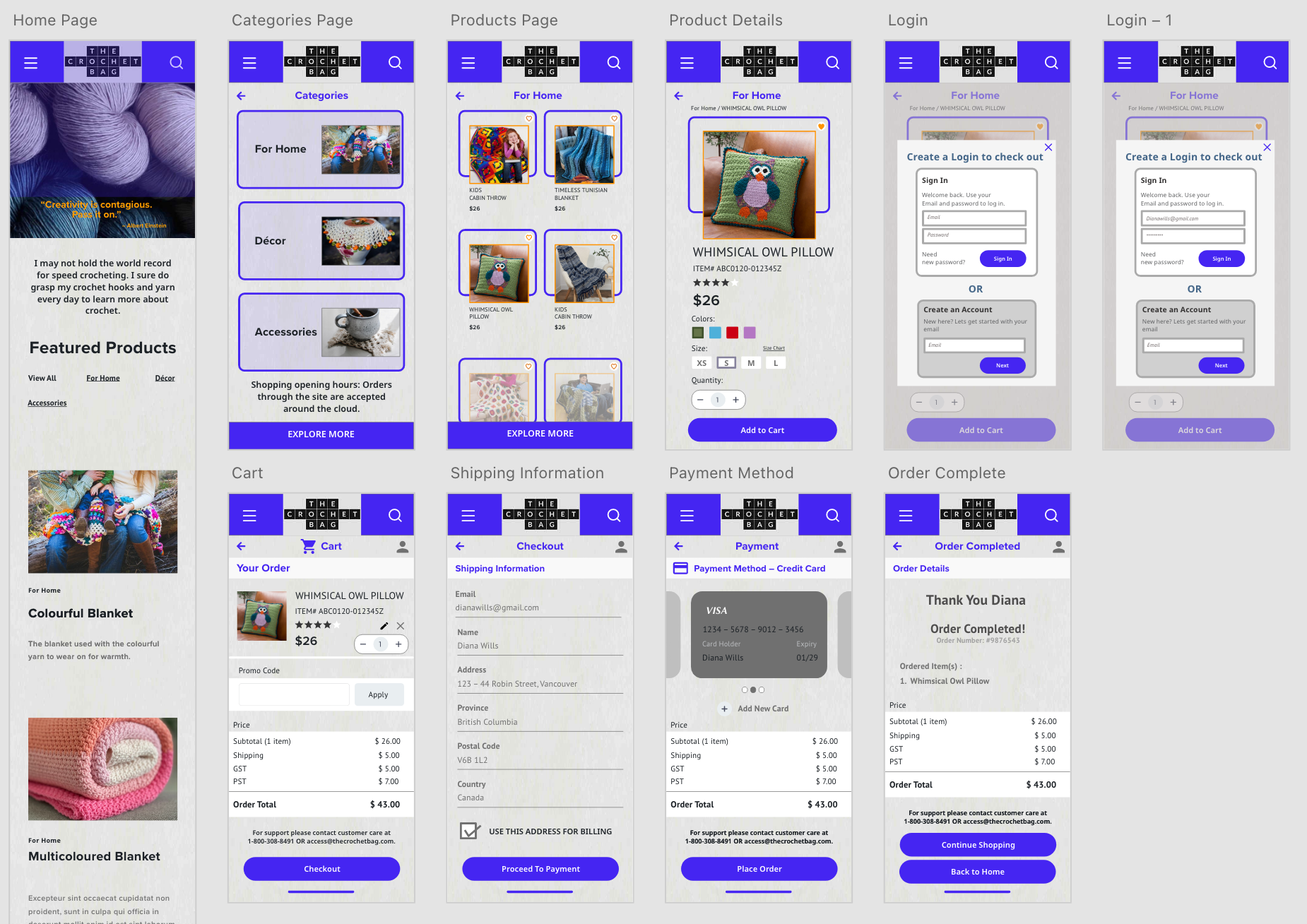
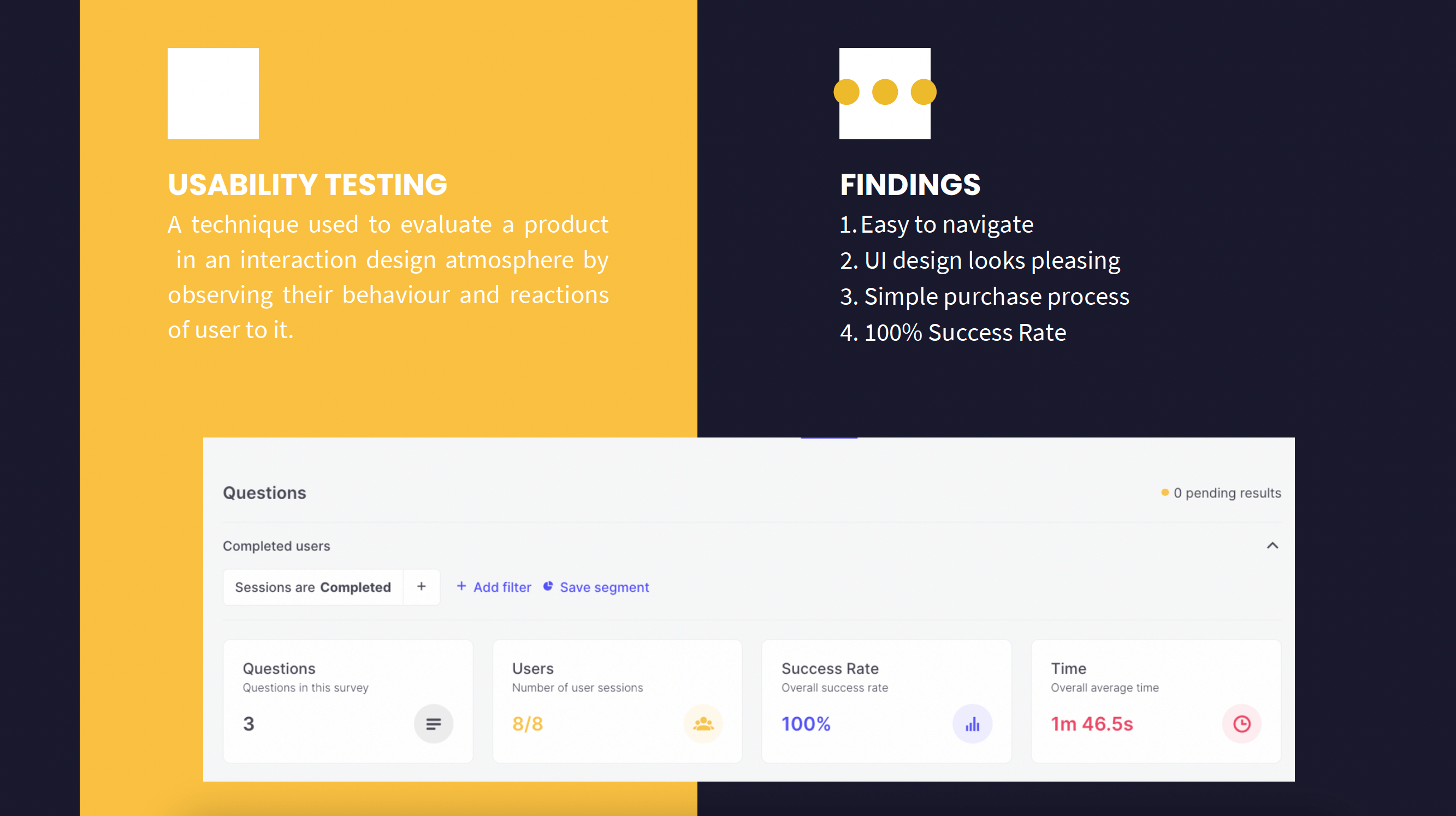
Usability Testing with Useberry
The prototype was assessed with an online software tool – Useberry. It enables the group of testers to independently examine the interface and determine any possible usability pain points.
