Yogá Sutrā — Mobile App Prototype
Branding • Wireframing • Prototyping • Usability Testing
Introduction
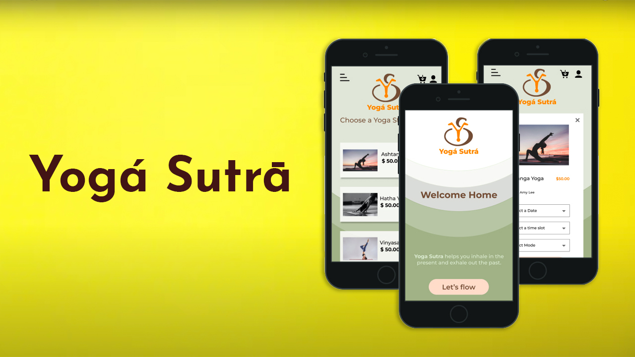
Yogá Sutrā is a fictional mobile app for a yoga studio brand. I created the prototype for a specific user archetype and target audience in mind. The design was implemented and made interactive with an emphasis on modern and minimalism that is consistent with the brand's mission using Figma and user-tested with Maze.
-
Role
UI/UX Designer
Graphics Designer -
Duration
3 Weeks
-
Tools Used
Ideation & Research
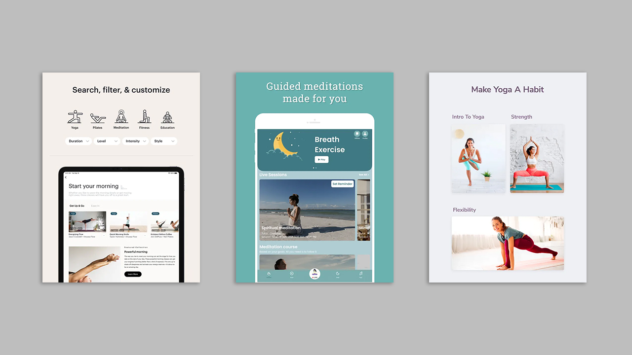
I came up with the idea for a yoga app called Yogá Sutrā that's designed for students and professionals who want to improve their mental health. The app allows users to sign up, bookmark classes, book yoga classes, and check out. I also brainstormed additional features like guided meditations, personalized recommendations, progress tracking, community features, challenges and rewards, virtual classes, and health and wellness resources to support users on their wellness journey.
Branding
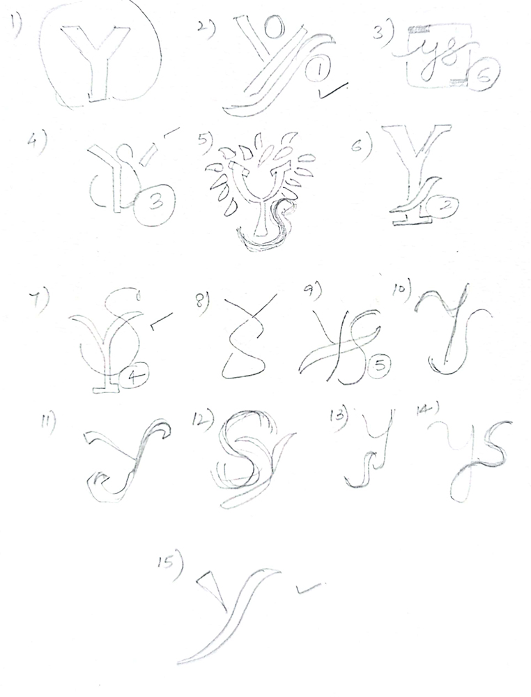
I created a fictional brand and designed a consistent user experience to align with the brand's vision. My idea was to create unique visual designs, which is why I designed a logo and style tile.
Developing Persona & Scenario
I created a persona to understand the needs and challenges of our primary and secondary audience, who are dedicated yoga practitioners. Then, I developed a user scenario based on the persona to show how and why a user would use our app.
User Flow
The flowchart outlines the steps a user would take to use the app and to plan the required screens. It covers account creation, logging in, bookmarking a class (optional), booking a class, and completing the checkout process.
Wireframe and Interactive Prototype Creation
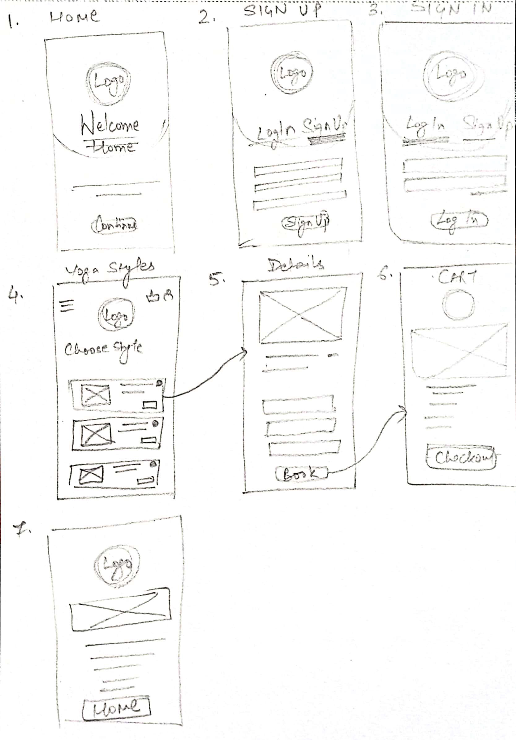
I created sketches of the main screens for the app, which included the startup screen, account creation/login, home, and checkout. I had the layout in mind before starting the sketches, so they were completed quickly. Additionally, I designed extra screens to showcase other features such as selecting from different yoga styles, flexible date/time/location options, finding and booking a class, and bookmarking favorites.
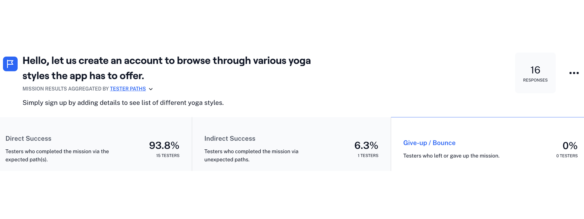
Usability Testing with Maze
I requested a few classmates to test the usability and design by completing few tasks. The results were positive, with a usability score of 96/100. One tester suggested that the text under the navigation icons appeared small, which I took into consideration for future improvements.
